Tag Archives: maps

The United States Of Good Beer

You folks always enjoy these silly maps, but I’m posting this one under protest as I detest it when beer snobs curl their lips at my Budweiser and stare disdainfully at the taps before accepting my offer to buy a round. “Wait, what do they have that’s good?” I feel the same way about coffee snobs who’ll drag me five …

Read More »

Explaining UK, Great Britain, England, Etc

(Tipped by Rex Wockner)

Read More »

Population Concentration

If all the people in the world had to live in one city, here’s how big that city would be based on the population densities of six examples.

Read More »

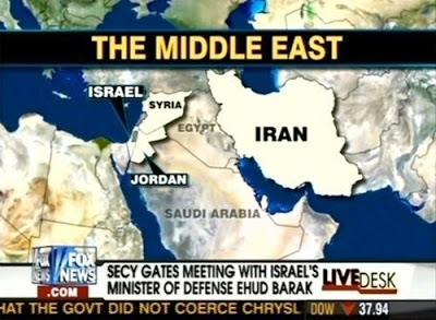
Fox News: Where’s Egypt, Again?

(Source)

Read More »

United States Of Awesome

The follow-up to yesterday’s United States Of Shame. (Source)

Read More »

United States Of Shame

Y’all know I love my silly maps, but I’ve resisted posting this one because some of the categories are so…baffling. Ugliest residents? But this one is apparently going viral. And now you can stopping sending it to me.

Read More »

NYC: Better To Rent Than Buy

According to a real estate study quoted by Gothamist today, it makes more financial sense to rent in New York City: “The median list price (for the top 50 cities) is $140,201.37, but the median price for a 2-bedroom apartment in NYC is $1.3-1.4 million! Median rent (for the top 50 cities) is $1,871.65, but it’s $3500-4000 in NYC for …

Read More »

The States By Famed Foods

(Source)

Read More »

The English Dialects Map Of North America

Gothamist calls the above “the world’s most confusing map.” (Massive version here.) According to the authors, sub-dialects of the eight major regional dialects exist in many places like Pittsburgh, Cincinnati, the Outer Banks, and perhaps most curiously, the Hamptons.

Read More »

What Does Your State Do Best?

The rest are here.

Read More »

The United States of Auto-Complete

Here’s what Google thinks the next words should be when you enter the name of a state. Hawaii, FTW. (Via – Gothamist)

Read More »

At Least We Woudn’t Have To Move

Only four nations have populations that coincide with their rankings in square miles: Brazil, Ireland, Yemen, and the United States. These “what if” maps have become quite the meme of late. (Source)

Read More »

Ten Centuries In Five Minutes

Read More »

America By TV Shows

A follow-up to the America By Movies map.

Read More »

America By Movies

I don’t know what it means that so many of my favorite flicks (at least the ones set on Earth) are used here. (Source)

Read More »

The Map Of Non-Monogamy

Complicated! Unicorn polyamory? Bigger version here.

Read More »

The World According To San Francisco

An accurate take on the familiar theme. Japan is my favorite. (Via – SFist)

Read More »

The True Size Of Africa

The same idea as the map I posted a few weeks ago, but better executed. (Source)

Read More »

Europe According To Gay Men

More amusing stereotype mapping here.

Read More »

Africa In Perspective

Read More »